IBM
Turning one long, dense form into five guided steps
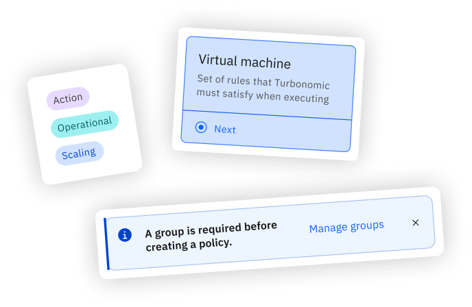
Firstly
Thanks IBM for a great summer :)
I'm so grateful I was able to have such a fun, exciting, engaging summer full of learning at IBM. I truly grew a lot as a designer, and I'm excited to take the unique skills I learned and bring it to my future work!!
TL;DR
Creating an automation policy in IBM Turbonomic meant one long, dense form. I turned it into five guided steps.
Overview
Automation, on the admin's terms
Turbonomic keeps applications performing by deciding what resources they need. Policies let IT admins choose which of those decisions run on their own, where, and when.
Problem
One form, five decisions
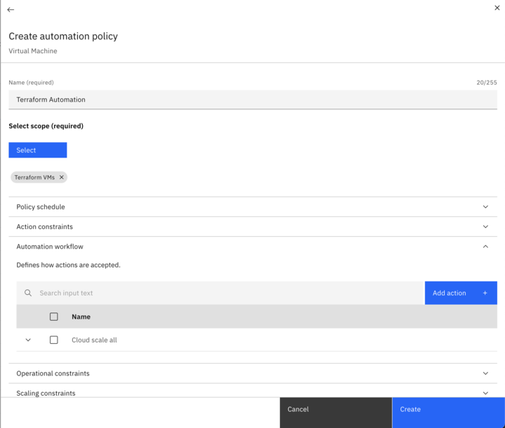
Scope, automation logic, constraints and schedule all lived in a single long form. Admins lost track of where they were and what they had already set.
The Goal
Make it guided, keep it powerful
Make policy creation feel guided without hiding the control admins rely on.
Mapping the Flow
From one page to five steps
I mapped the flow as it was and as it could be, to see where admins doubled back and which decisions belonged together.
Everything on one page, in one scroll.
Auditing the As-Is Flow
What's the current solution? What are clients saying? How can we make it better?
We knew the general pain point regarding policy automation creation, but not the nitty gritty details. To start our solution journey, we assessed the current user experience and gathered pain points that surfaced each step, if it had any.
Coupled with the user flow, to tie it in visually, we mapped an as-is journey flow.
As part of synthesizing and organizing our findings, we compared it against Nielsen's Heuristics and mapped each pain point to a respective guideline/heuristic the pain point was falling under. Heuristics included:
- 1: Visibility of System Status
- 2: Match Between the System and the Real World
- 3: User Control Freedom
- 4: Consistency and Standards
- 6: Recognition Rather than Recall
- 7: Flexibility and Efficiency of Use
- 9: Help Users Recognize, Diagnose, and Recover from Errors
- 10: Help and Documentation
3 Key Insights came out of our preliminary research and guided our goals and solutions:
1. Missing Context and Documentation
Users aren't failing because the UI is laid out wrong, they are failing because the system never explains what they're choosing or what it means.
2. Structural/ Sequencing Confusion
Users get lost not because individual screens are confusing, but because the system hides sequences and dependencies. Schedules are ordered backwards from how they're used, and workflows must be built in an entirely different part of the product before policy creation even acknowledges they are needed.
3. Discoverability/ Affordance Issues (Simple UI fixes)
Small affordance gaps make the interface feel untrustworthy in moments that otherwise require no explanation at all, just clearer visual signaling.
Wireframing
Sketches and early designs
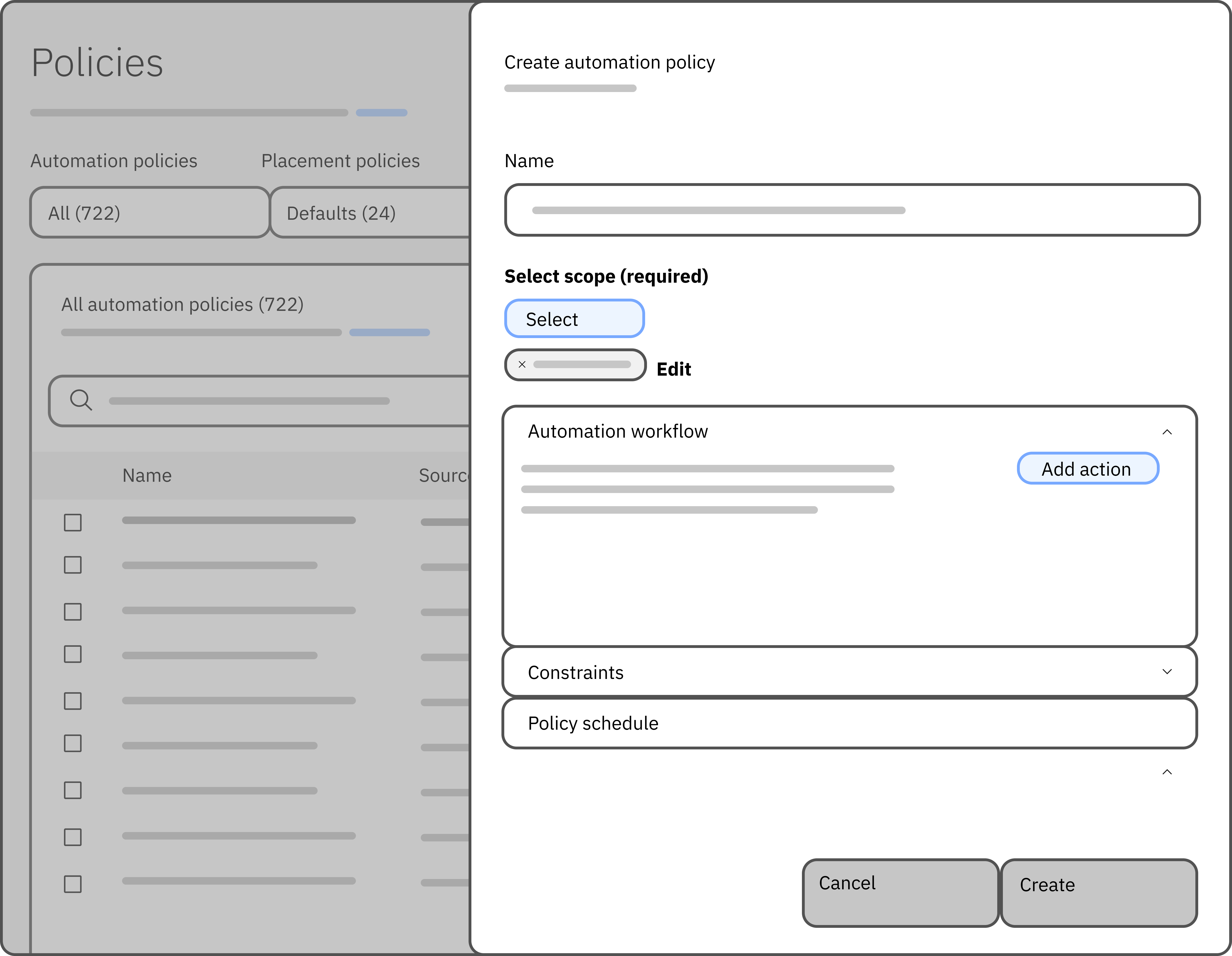
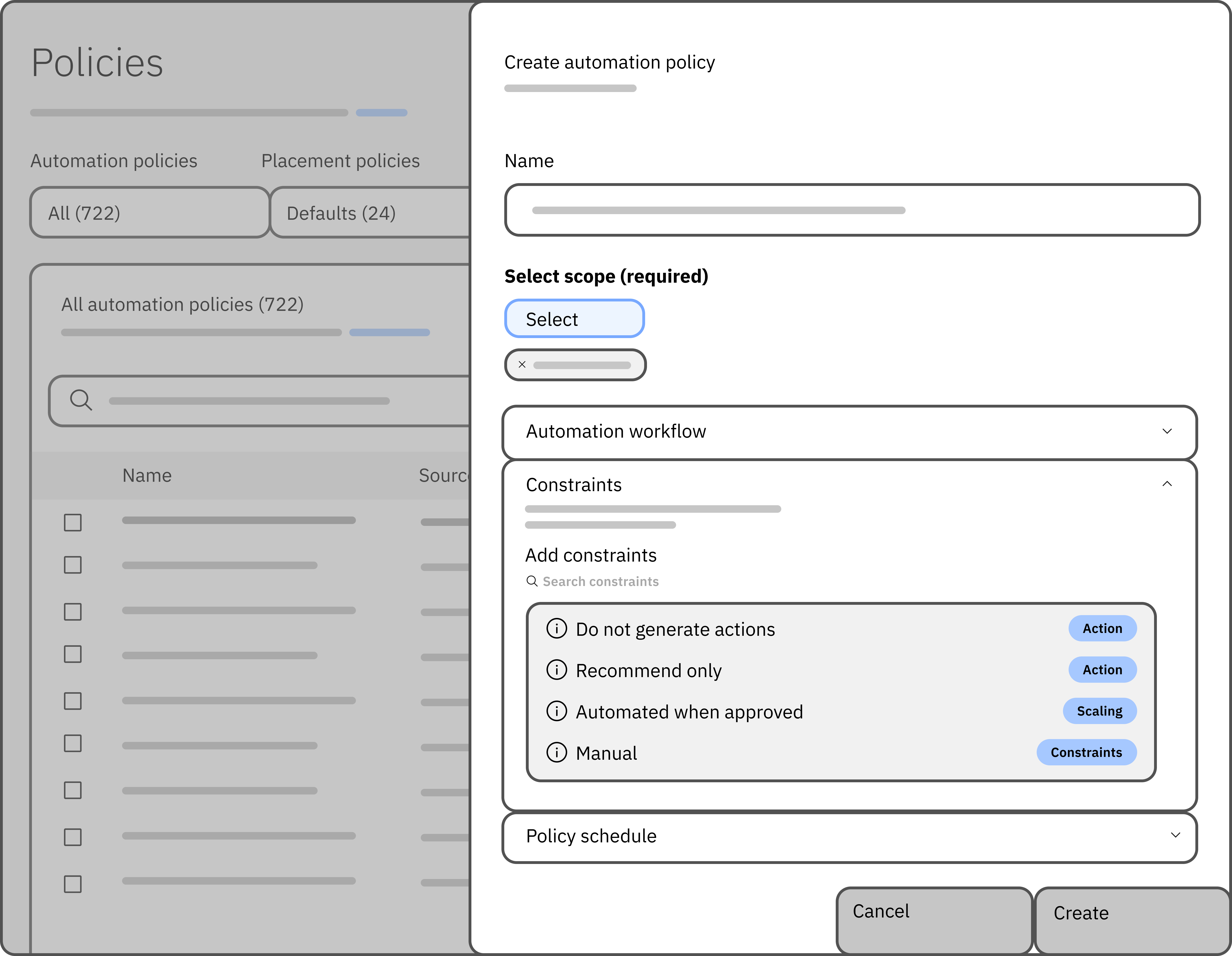
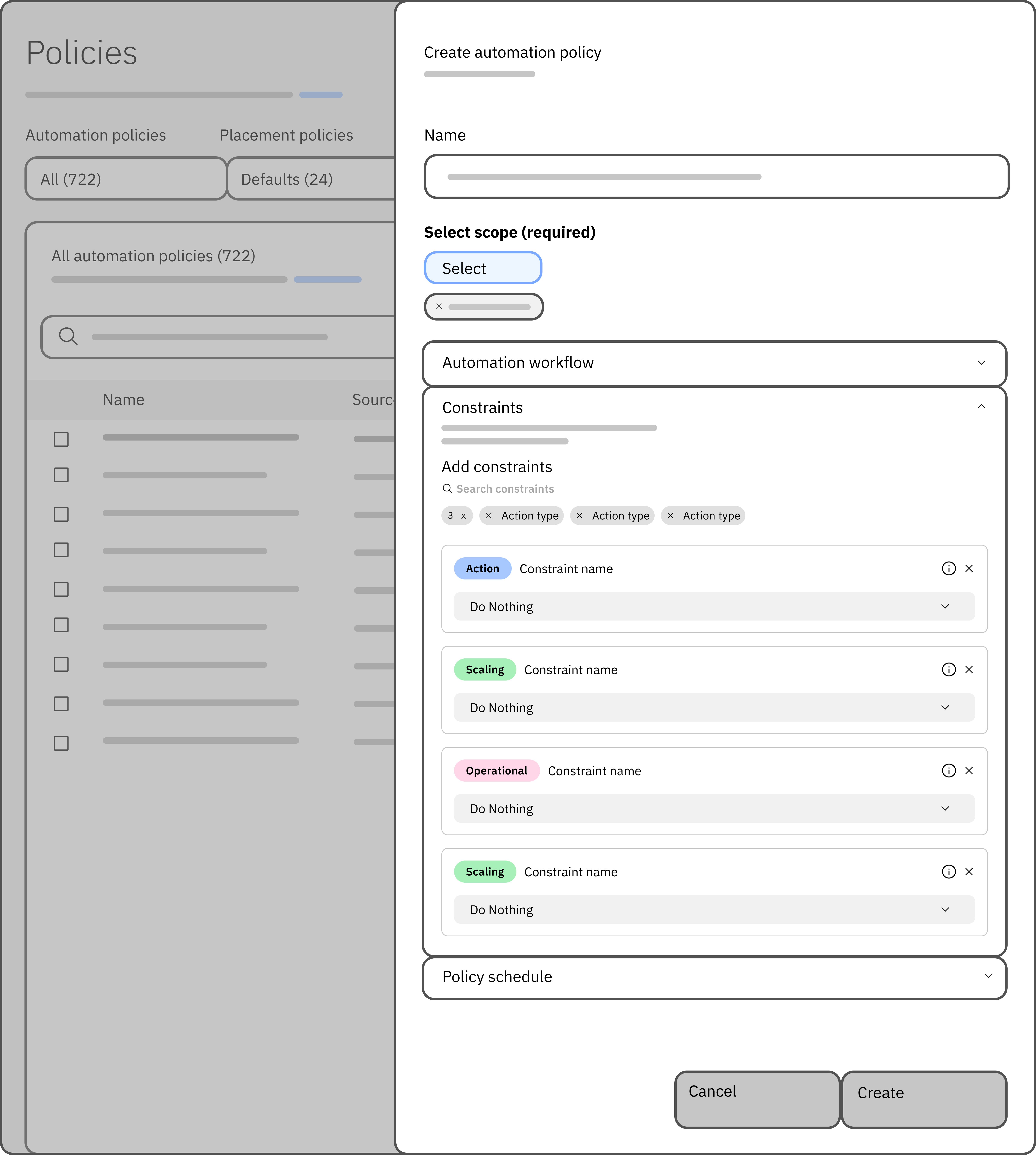
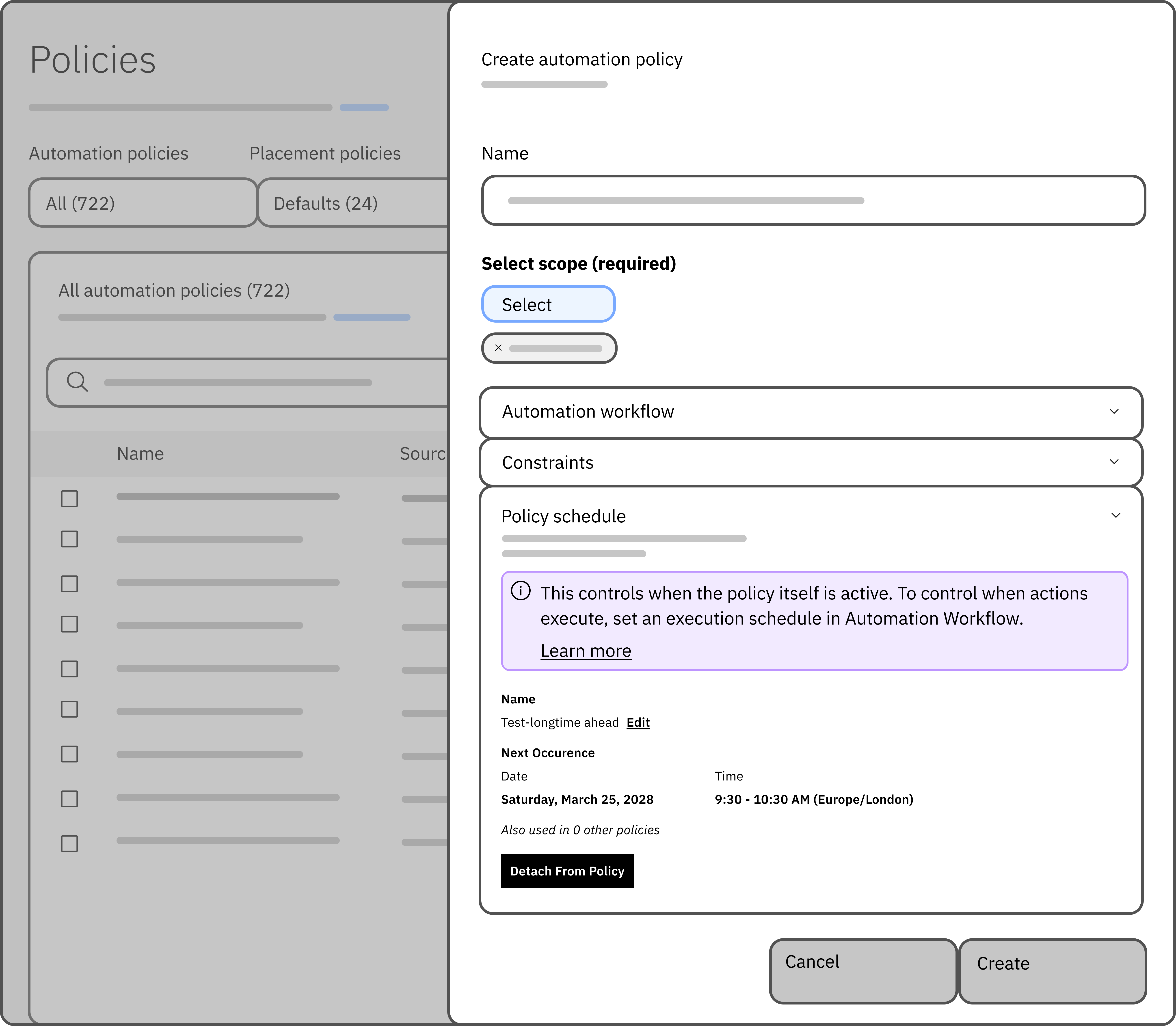
With our to-be flow, we set intentions and ideated what our design solutions would look like.
Solution
A new way to automate
Scope · 1 of 3
Prerequisites, before you start
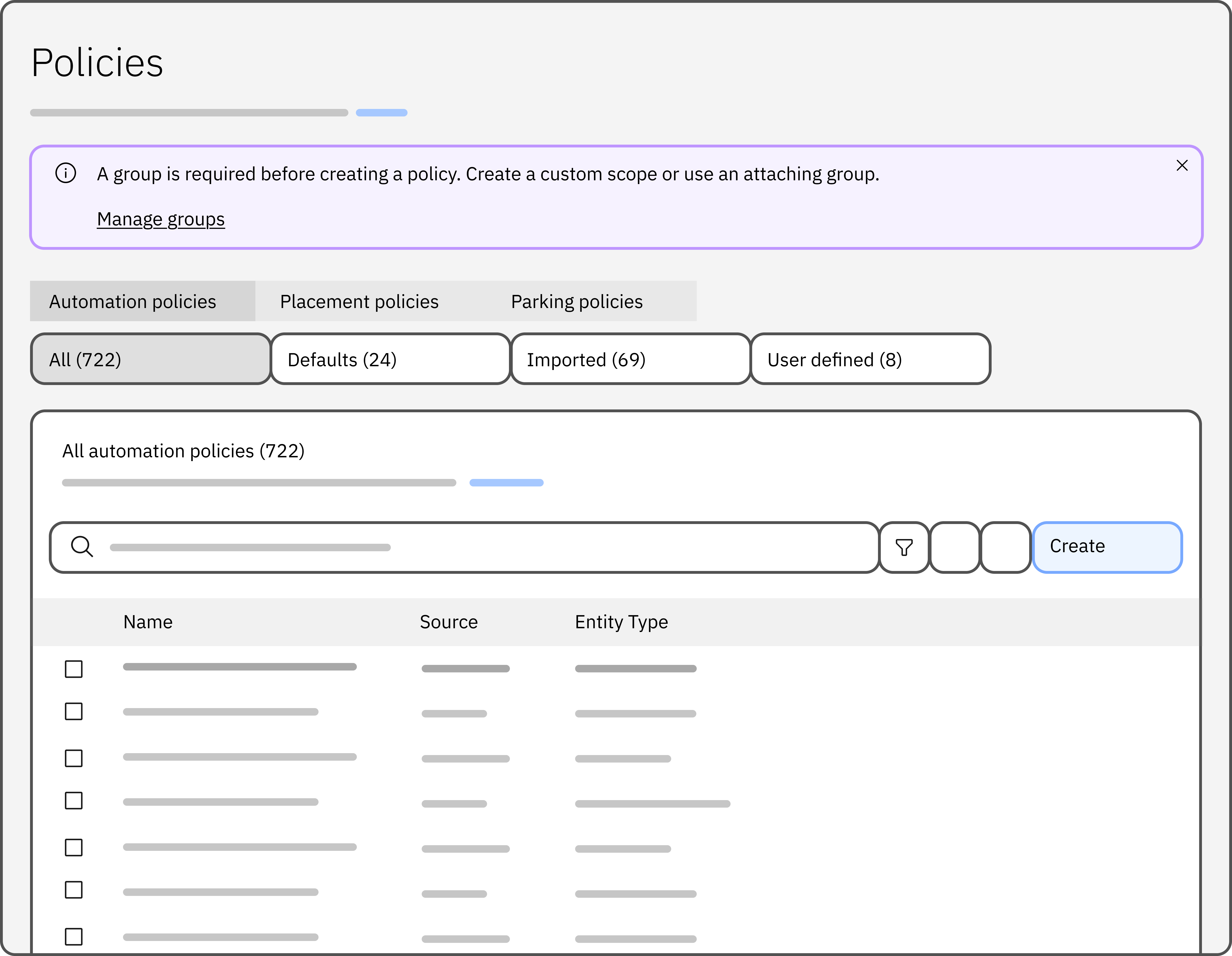
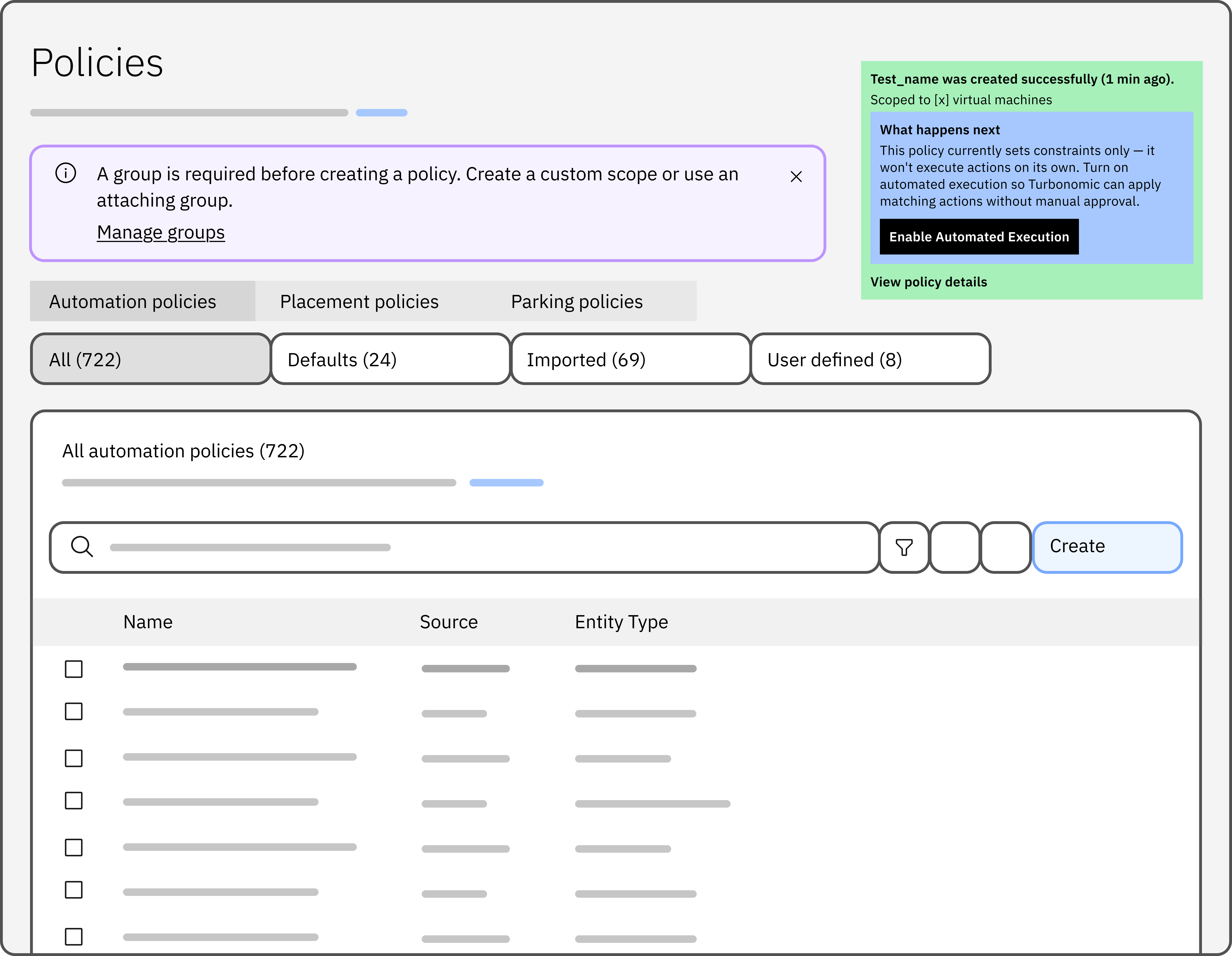
Every policy needs a group, but the old flow only said so once you were already filling in the form. Now the Policies page says it up front.
- 1A banner explains the group requirement, with a shortcut to Manage groups.
- 2Create opens a guided, step-by-step flow instead of one long form.
Testing
Two waves of usability testing
Sanya and I designed a two-wave System Usability Scale study with researcher Tanvi Joshi. Wave 1 measured the old form; wave 2 measured the redesign.
Reflection
What's next
I walked stakeholders through the five phases in a deep-dive and supported QA. Next, I would…